In my talk on bad statistics in medical research, I showed the infamous plot of Z-values created by Erik van Zwet.
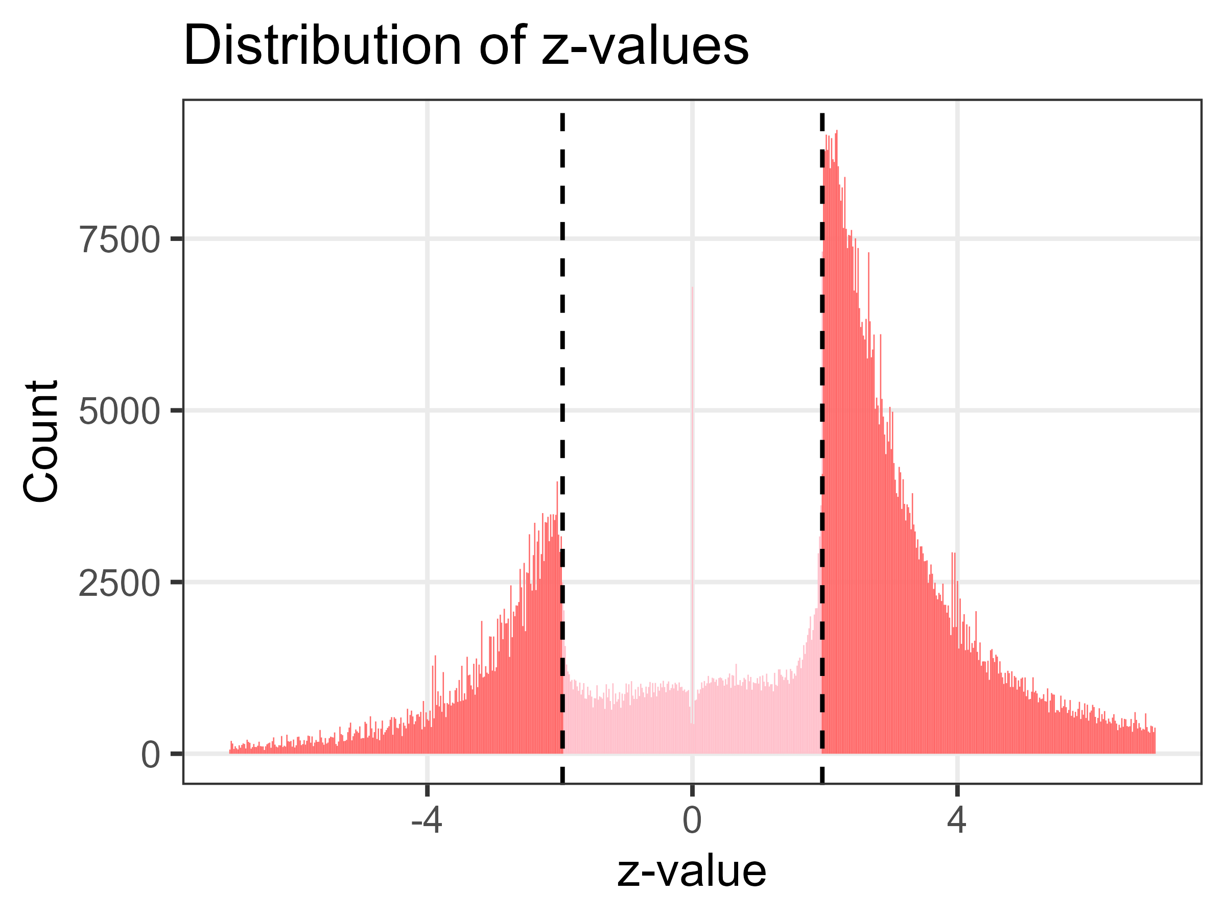
A version of the plot made with David Borg is shown below. The sample size is over 1.1 million Z-values.
 {width=450px}
The two large spikes in Z-values are just below and above the statistically significant threshold of ± 1.96, corresponding to a p-value of less than 0.05. The plot looks like a Normal distribution that’s caved in.
In my opinion, this is evidence that research misconduct is widespread. Lots of researchers are re-analysing their data until they get a “significant” p-value, using tricks like removing outliers, collecting more data, adjusting for different variables, etc.
Misconduct or publication bias?
I had an interesting question from Kyle Sheldrick about my interpretation, and whether this was predominantly misconduct or mostly publication bias. Publication bias is where journal editors and peer reviewers more likely accept papers with results that are statistically significant, so this would also create spikes in the Z-values at ± 1.96. There’s good evidence that publication bias exists, thanks to a neat randomised trial that manipulated p-values and found papers with significant p-values were much more likely to be accepted.
So the question is, what is the predominant cause for the spikes? Publication bias from journals or misconduct by researchers? Not the happiest question, but one worth answering.
PLOS ONE
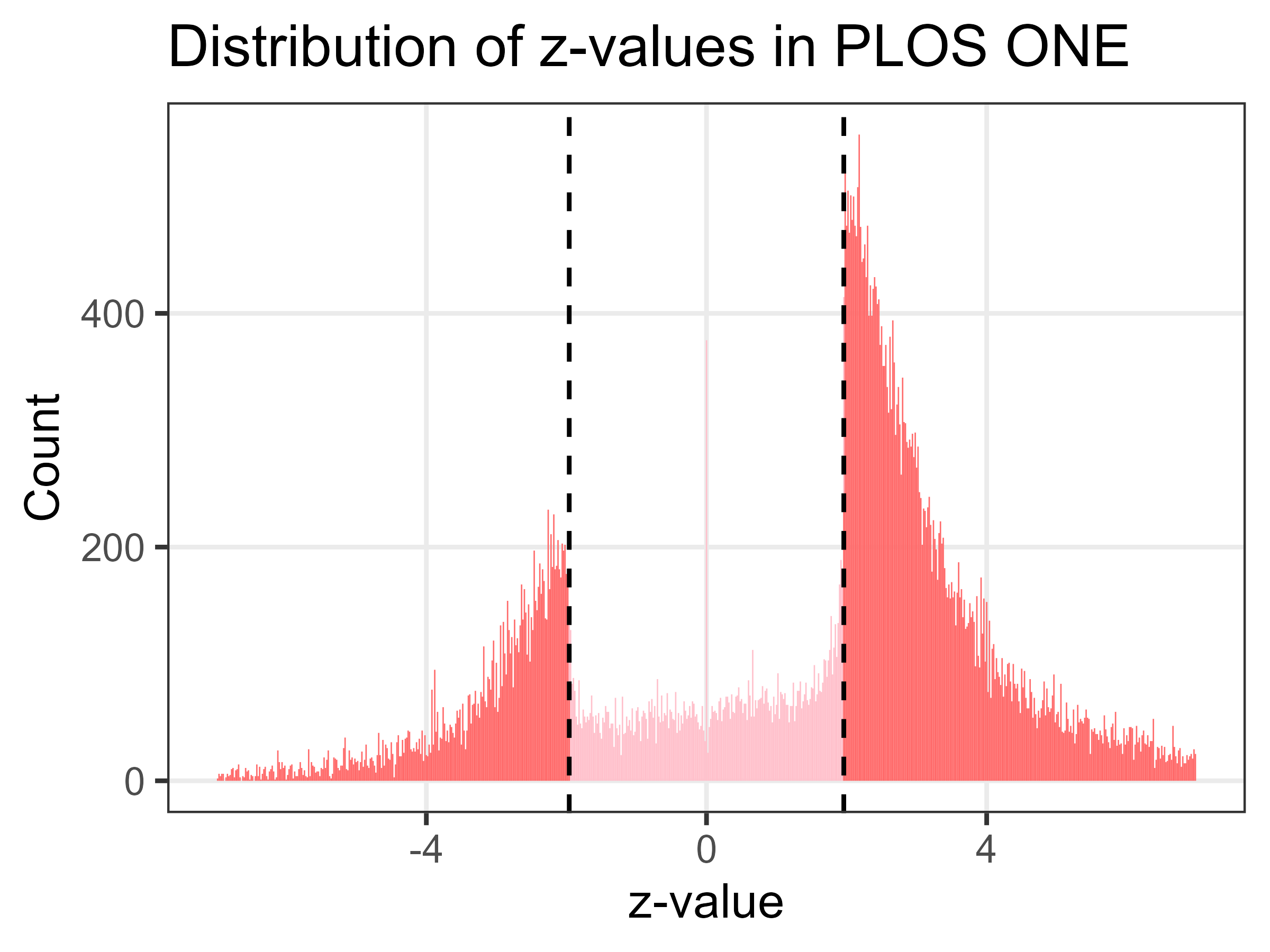
To somewhat answer this I have created the Z-plot using only results from the journal PLOS ONE. Theoretically this should be free from publication bias because: “The editors make decisions on submissions based on scientific rigor, regardless of novelty”.
So a well conducted study with a p-value over 0.05 should still be accepted by PLOS ONE. Reviewers should not be able to use a lack of significance as a reason for rejection, although some may still apply their biases covertly.
Looking at the plot below (sample size over 64,000), it’s clear that there are still huge spikes in Z-values at the magic P < 0.05 threshold. This cements my belief that research misconduct is widespread.
 {width=450px}
Data sharing
There’s a positive coda to this work.
The data used in the plots were from my study with Jonathan Wren, who provided the excellent algorithm for extracting ratio confidence intervals from papers. When plotting the results, I struggled to get across the sharp change in lower/upper intervals that were just above/below 1 (making them statistically significant). I tried log-transforms and truncating the axes. In the end, my plots did the job, but not brilliantly.
We openly shared our data, and they were re-used by Erik van Zwet who had the great idea of transforming the intervals to Z-values. That did a much better job of showing the huge gap in null results, and the plot was widely shared on Twitter.